Tuesday, 19 November 2013
Fedora 20 Supplemental Wallpapers
Wednesday, 27 February 2013
Consistent Perspective in a Group of Icons – How To
I've been creating a bunch of Echo icons lately and one thing I wondered how to do properly is perspective. It's easy to do thinks consistently if you're using some kind of metric projection (e.g. isometric), because you have simple linear transformations from (X, Y, Z) to (x, y). That's not true for perspective. How the 3D projects to 2D depends on the shape, on the position, on the size and many more factors when projecting with perspective. Because I was creating many icons at once, all flat ones with constant thickness, I wanted to do this not only consistently, but also quickly. I've came up with the following workflow.
Start with drawing the front face of the icon on the canvas, just like if you were drawing pure 2D.
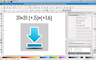
Then duplicate the canvas as well as the icon shape. Don't forget to change colours so that you can easily tell them apart.
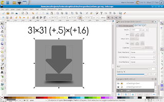
Next change the size of them by some factor and use the same factor for every icon you create and is supposed to have the same thickness. The resize should be done to both canvas and the icon shape at the same time so that it scales properly, keeping the ratios and position of the icon on canvas.
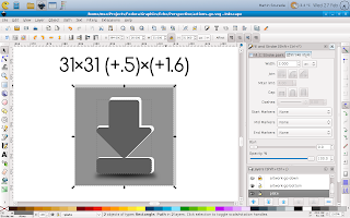
Then move the resized canvas together with the icon shape to it's new position. Again this has to be done consistently for all icons with the same thickness. You can imagine that the original and edited canvas create together some kind of cuboid whose front and back faces are squares, even in the 2D projected image its thickness regulates thickness of the icons and the relative position of its back side to the front side controls your point of view.
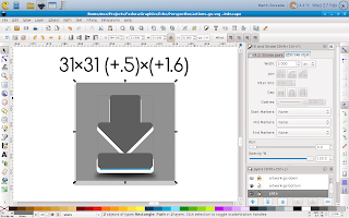
Next delete the changed canvas (we don't need it anymore) and put the back side of the icon behind the front one.
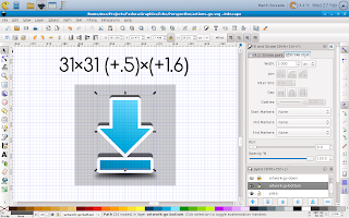
Next you should remember that you're doing an icon so it should be properly aligned to pixel grid in order to look crisp. This can be done quickly with the help of inkscape grid feature.
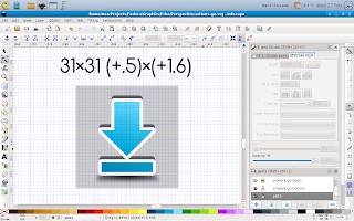
Now we have front and back side of the icon, but we still don't have it's sides, as can be seen on the next picture.

The easiest and for simple icons also the best way to do them is to duplicate the front side again, merge it with the back side and fix those bumpy parts to look as you'd expect them using the node tool.
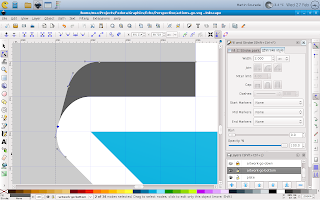
Now the icon is only missing some shading and outline.
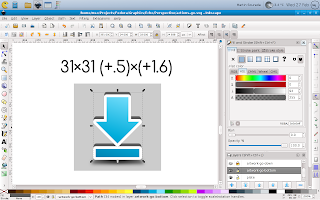
So next we add some gradients to make it look as we wish – this can be a tedious task, depending on how realistic we want the icon to look. On small size like this one it can be greatly simplified though. And finally we add an outline. This can be done by duplicating the edited shape again, adding an outline that is twice as wide as we want it to be (because half of it will be hidden) and push it bellow the whole icon. The result looks like this:
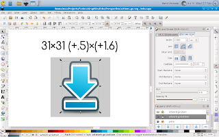
Finally we render the icon in desired size with transparent canvas and it looks like this:

I hope you like my today's how-to :-) Also, bear in mind that this is greatly simplified perspective projection as we use it in icons, if you were going for fully realistic painting you'd quickly find this workflow isn't suited for such task.
Thursday, 7 February 2013
(XFCE) Terminal and XChat Colour Scheme
I'm a regular terminal user and with F18 I switched back from Sakura to XFCE Terminal, because for some reason sakura refused to get configured as before (I think I wasn't able to remove window borders anymore)—I prefer terminal in some kind of semi-full-screen mode, i.e. maximized (but with DE panel[s] still visible), without menu, without window borders, without scrollbars. And while I was at the configuring, I decided to change the default colour scheme. It's not like I particularly dislike it, but as a regular mc (midnight-commander—there isn't a better file manager out there) user, I kinda grew to dislike the blueness of the default blue and some kind of colour combinations weren't exactly easy to read (hinted fonts are partially to blame for that though, by design). So first I searched a bit over the net, but didn't find anything satisfactory, so I decided to adapt Echo Icon Theme Palette for terminal use (black terminal, I've also prepared a bright/inverse version for xchat). First how it looks:
And now for the actual colours. Here's an excerpt from ~/.config/Terminal/terminalrc:
BackgroundMode=TERMINAL_BACKGROUND_TRANSPARENT
BackgroundDarkness=0.950000
ColorPalette1=#000000000000
ColorPalette2=#b4b400000000
ColorPalette3=#0000aaaa0000
ColorPalette4=#cbcb7c7c0000
ColorPalette5=#00003f3f6868
ColorPalette6=#bfbf0000efef
ColorPalette7=#0000a61dd074
ColorPalette8=#c6c6c6c6c6c6
ColorPalette9=#5ef75ef75ef7
ColorPalette10=#ffff52990000
ColorPalette11=#9393dada0000
ColorPalette12=#ffffe1e13939
ColorPalette13=#00007373a2a2
ColorPalette14=#dbdb8181ffff
ColorPalette15=#8181e3e3ffff
ColorPalette16=#ffffffffffff
ColorForeground=#c6c6c6c6c6c6
ColorCursor=#c6c6c6c6c6c6
TabActivityColor=#00003f3f6868
ScrollingSingleLine=FALSE
You can notice I also included ScrollingSingleLine=FALSE—that makes shift+arrows work in mc to select items ;-)
And now from ~/.xchat2/colors.conf
color_0 = 0000 0000 0000
color_1 = ffff ffff ffff
color_2 = 5050 d8d8 ffff
color_3 = 5b5b b5b5 0000
color_4 = ecec 2828 0000
color_5 = d7d7 a1a1 3c3c
color_6 = d4d4 6767 ffff
color_7 = b4b4 0000 0000
color_8 = 6666 3c3c 0000
color_9 = 0606 9090 0000
color_10 = 0000 7373 a2a2
color_11 = 0000 3f3f 6868
color_12 = 0000 adad dbdb
color_13 = bfbf 0000 efef
color_14 = 5e5e 5e5e 5e5e
color_15 = 3030 3030 3030
color_16 = 0000 0000 0000
color_17 = ffff ffff ffff
color_18 = 5050 d8d8 ffff
color_19 = 5b5b b5b5 0000
color_20 = ecec 2828 0000
color_21 = d7d7 a1a1 3c3c
color_22 = d4d4 6767 ffff
color_23 = b4b4 0000 0000
color_24 = 6666 3c3c 0000
color_25 = 0606 9090 0000
color_26 = 0000 7373 a2a2
color_27 = 0000 3f3f 6868
color_28 = 0000 adad dbdb
color_29 = bfbf 0000 efef
color_30 = 5e5e 5e5e 5e5e
color_31 = 3030 3030 3030
color_256 = ffff ffff ffff
color_257 = 0000 7373 a2a2
color_258 = 0000 0000 0000
color_259 = ffff ffff ffff
color_260 = cccc 1010 1010
color_261 = 0606 9090 0000
color_262 = 0000 7373 a2a2
color_263 = 5b5b b5b5 0000
color_264 = 5e5e 5e5e 5e5e
Hope it's useful to other people than me as well. I find it both easier on eyes, and having better readability (with the font I'm using, it seems this one is important too).
PS: For those wondering about some differences of my desktop compared to previous screenshots—when trying out CentOS 6, I got addicted to analog clock ;-) And a little while before I decided to hide the bottom panel automagically to have more space for apps.
PPS: My apologies for having some comments in my moderation queue for too long, somehow I wasn't notified via mail, or missed them. I definitely don't censor, the moderation is for spam purposes only (or for cases were people post the same reaction multiple times).
Update (2013/08/08): In Fedora 19 (and newer), the xfce terminal config is in different place and colours are specified slightly different. Here's excerpt from ~/.config/xfce4/terminal/terminalrc:
ColorPalette=#000000;#b40000;#00aa00;#cb7c00;#003f68;#bf00ef;#00a6d0;#c6c6c6;#5e5e5e;#ff5200;#93da00;#ffe139;#0073a2;#db81ff;#81e3ff;#ffffff
ColorCursor=#c6c6c6c6c6c6
TabActivityColor=#00003f3f6868
ColorForeground=#c6c6c6c6c6c6
Monday, 31 December 2012
Designing Echo icons again
It's been a while since I designed my last icon but for one reason or another I decided I need to make some progress with Echo Perspective Icon Theme again… The final push was me playing with colours—when I had started writing code for Nodoka, I begun with a colour representation. Since we use gradients and shades a lot, I decided to go colour managed and started researching about colour representations and ended up redoing Echo colour palette in sRGB using CIE Luv (in Luma, Chroma, Hue coordinates) as a working space.
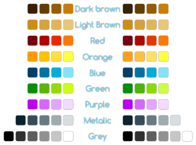
The resultant palette is redone from scratch based on the Echo (Perspective) icons that have been already released instead of the current palette for better consistency, but it's "normalized" WRT CIE Luv colour space. The result looks like this:
The right column actually uses normalization WRT CIE Lab colour space, but I decided to stick with the CIE Luv one, which is in the left column. The differences are subtle though.
From there it was ony one step to doing icons, actually. I went all out and decided that I'll
- make more sizes than before to better support current and future DEs, i.e. 16×16, 22×22(24×24), 32×32, 48×48, 64×64, 128×128 and 256×256;
- make similar icons in a single file svg (which means I'll need to write some helper libraries to help split it automatically during build);
- start with action icons in media player, browser and related, which is 23 icons in two groups.
Well, it's a lot of work—23 icons, each in 7(8) sizes, that's 161 pictures. Ugh, that will take a while... Some preview WIP is bellow:
You can notice some design changes, some are new, some have been appearing for a while already, albeit inconsistently. First I went back to slightly darker blue hues than what we were doing recently, it makes better contrast and should work a bit better with darker backgrounds. You could have noticed this design change in my nodoka designs as well (there were three icons in them).
Second change that has been already visible in nodoka designs, is departure from sharp corners. They make the images unnecessary bigger (especially the arrows) and look kinda oldish. I decided that the white outline as well as border should have rounded corners. IMHO it looks better and I hope to retain this style consistently throughout Echo Perspective.
Last change is to shapes—first one I did was view-refresh. The old two big arrows looks sort of heavy and are hard to do at smaller sizes. So I've done something simpler and later I noticed that my new e-book reader uses similar style while loading, lol. My primary source of inspiration in this was an anime I liked for its easygoing style and, believe it or not, typesetting (the anime is called acchi kocchi):
Second shape change was for process-stop icon from circle to the more common octagon. And finally a small change to media-record icon for it to be better distinguished from similar dialog related icons like dialog-no.
Sunday, 9 September 2012
Nodoka Concept Art—Finished
Nodoka Glossy
Nodoka Classic
Nodoka Modern
Nodoka Noir
If the pictures are blurry you can see them in original size on Nodoka 1.x concept art wiki page.
I hope you like it, comments are welcomed. Also bear in mind that this is concept art, not a working example. So the working example will look slightly different and moreover I haven't started writing it yet.
Thursday, 6 September 2012
Fedora 18 Alpha Wallpaper
It's rather old news, but today it has been finally set as default—yes the wallpaper for Fedora 18 Spherical Cow release. It took so much time because I didn't manage to update the package that sets the defaults in time before Alpha freeze.
You probably have a general idea of what the wallpaper looks like from my post about pre-alpha version of it, but since then it has been polished a bit—mizmo did a great job on that—and now it looks like this ;-)
Enjoy.
Update Sep 08: I'm not the author of the wallpaper, just a packager, so do not thank me ;-) However, I'm relaying your feedback to the design-team, so I really appreciate all the comments you've posted so far. I'll keep both my readers as well as the design team informed about news on both sides, so comment more and stay tuned for updates ;-)
Saturday, 11 August 2012
Fedora 18 Pre-Alpha Wallpaper
It's been a while since I last blogged, but as I have some design news, it's worth writing a blog post again. Yesterday there was another design team meeting&hackfest and we were able to agree on the theme for the Fedora 18 Sperical Cow wallpaper. The latest iteration, I still call it pre-alpha because I expect there'll be some polishing yet before alpha release looks like this:
I've packaged it and submitted a review request, which is currently in need of a reviewer.
We at the design team hope you'll like it and of course are open to comments and suggestions. We'll hear you out in our usual channels: #fedora-design @ irc.freenode.net and Fedora Design Team Mailing List.
Wednesday, 23 November 2011
Fedora 17 Beefy Miracle Wallpaper—Accepting Concept Artwork
Submit your concept work here:
https://fedoraproject.org/wiki/F17_Artwork/Submissions/Wallpaper_Concept
Wednesday, 21 September 2011
Fedora 16 Verne Beta Wallpapers
Sunday, 7 August 2011
Nodoka Concept Art – Noir WIP

Hopefully, sometime in the future I'll finish all these concepts and start writing the actual code but seeing how much spare time I have, it seems to be rather distant future… Anyway, comments are welcome and sketches even more so. Get source SVG now!
See an older post for the other two styles concept art.
Saturday, 30 July 2011
Fedora 16 Verne Wallpaper
Alpha release of next Fedora installment codenamed Verne is nearing and so is its Alpha freeze. Hence the Fedora Design Team selected a winning wallpaper design and I packaged it for F16 onward. It's currently pending pushing to stable. If you're on F16 or rawhide you'll be able to install these with
# yum install verne-backgrounds-gnome for GNOME, # yum install verne-backgrounds-kde for KDE and # yum install verne-backgrounds-xfce for XFCE. At the same time as the new package hits repos an updated desktop-backgrounds that sets is as default for GNOME, XFCE and LXDE-and-alike (e.g. LXDM) will also appear and so in Alpha this should be default everywhere except KDE (these need some more work first and sadly we didn't realized that when creating a design team schedule for F16).And for those wondering what is the winning picture, here's a screenshot of it in my F15 XFCE desktop ;-)

As usual, the Fedora Design Team is looking for feedback on this via the usual channels:
- You can comment under this blog post and I'll summarize your opinions to the Design Team.
- Fedora Design Team mailing list
- at #fedora-design on irc.freenode.net, supposing you catch one of the Design Team members there.
Sunday, 1 May 2011
Another Update to Nodoka Concept Artwork

To remind you, here's the MODERN style concept artwork – this will be the default style once the code will have been written…

Before moving on onto the next stage of development I plan to prepare a special style aimed for especially dark themes but I don't have yet a clear image of what it should like yet so *hint, hint* if you'd like to propose something now's the time *hint, hint* ;-)
PS: The progress indicator (the blue round snake-like thing) in GLOSSY style was real pain in the butt to design to look at least approximately how I'd like it to and the result is quite messy. If there's any inkcape guru who might know some pointers how to make it more easily and cleanly, please spare a little bit of your skills with me ;-)
Tuesday, 12 April 2011
Beefy Miracle Lost, But…

Sunday, 27 February 2011
What's Up With Nodoka
So I'm afraid I have to disappoint you all as you'll have to live without nodoka for gtk3 for still some time (basically until I find enough motivation and time to port it). Of course if there'd be a volunteer(s) who would port the engine code and/or rewrite at least one of the themes to work with gtk3 that would be greatly appreciated.
However, I've not been completely stale either. Since I'll need a rewrite for the gtk3 version as well I slowly resumed on the design part of things and updated a little the glossy style. Here's what I've got so far, comments are welcome.

And here's the other style concept work (that I completed some months ago) for comparison:

Friday, 17 December 2010
Upstream vs. Downstream—Clash of Visual Identities
It is understandable that with such a big release upstream seeks even more aggressively to promote it. Along with the visual identity. And thus there is a request for Fedora 15 to use Gnome 3 wallpaper for Gnome 3 desktop. And here comes the problem—upstream wants its visual identity, while downstream also wants its own visual identity.
For a linux distro the ideal case is that across all flavours, the visual identity is the same. The work-flow, style, etc. remain DE specific, but widget theme, window decorations, panels, wallpapers, icons, fonts are consistent through them all. Of course I doubt there is any community around a specific distro, except maybe Canonical when they put their money into it, that can achieve that.
On the other side of the spectrum is upstream ideal case where all distros look the same. However this is in direct clash with the above ideal.
So how to solve this for Fedora? In past releases we have proven that we are able to make part of that identity—wallpapers and everything connected with them. And do it once per release. Should we now yield and use upstream defaults for F15, for GNOME? Should we treat them special? Remember, KDE4 wasn't treated specially back then. Why should GNOME be now?
While I understand why would upstream developers want that, I still think they should focus on promoting something different than visual identity. Yeah, they ought to use a consistent theme for that promotion, something that is available on all distributions as at least a second choice, something that "smaller" distributions without well-established design team could use. Something that we could call the canonical visual identity. However, they should not push it onto distributions. I think that if we are able to create a visual identity, or part of it, for Fedora specifically, we should, irrespective what anniversary any of upstream projects have, create and use it. As it is the visual identity that leaves the first impression and you should be able to tell just by looking that you're running Fedora when using defaults. And that's the memo, now shoot me :-D
PS: And of course, as part of Fedora, we should be the first to actually achieve the ideal of having a cross-DE single visual identity created fully by a community and the ones to push any changes necessary to make it possible upstream (not like Canonical who just like to reinvent a wheel instead of improving the almost-wheel).
PPS: Yes, Fedora is all about upstream, but IMHO that makes sense in bug reporting/fixing, feature implementing, etc., not in default settings.
Tuesday, 30 November 2010
Fedora 15 — Wallpaper Submissions Open

With Fedora 14 out of the door we are working on the artwork for Fedora 15 Lovelock. Our first step, as usual, is gathering general artwork concepts. Do you have an idea how could Lovelock wallpaper look like? Feel free to submit concept art on our wiki! The theme is lovelock, let you fantasy run wild. And don't be shy! This is initial concepts phase, so even if the actual submitted artwork is very rough, if the concept is strong, there is high possibility it would be used. The deadline for default theme concept submissions is Tue 18 January 2011, 18:00 UTC.
Supplemental Wallpapers
Just like with Fedora 14, we would like to create a set of hand-picked wallpapers that we would package and thus made available easily via yum (or PackageKit). If you know about a good freely licensed image that could be used as an wallpaper don't hesitate and submit it! The procedure for submission is on our wiki.
The deadline for supplemental wallpapers submission is Mon 7 March 2011, 23:59 UTC.
Sunday, 17 October 2010
Some Things Suck
laughlin-backgrounds-animated-gnome (after the package is in repos, or by downloading it, and it's deps, from koji).
Thursday, 14 October 2010
Fedora 14 Laughlin Wallpaper Ready
- laughlin-backgrounds-single — contains single screen images, one per screen ratio (16:10, 4:3, 5:4). The image here is used as noon image in the time-of-day animation.
- laughlin-backgrounds-gnome — contains other images needed for time-of-day animation and stuff needed to be able to use it in Gnome. Requires laughlin-backgrounds-single.
- laughlin-backgrounds-kde — contains stuff needed to use it KDE. Requires laughlin-backgrounds-single.
- laughlin-backgrounds-extras-single — contains images for Supplemental wallpapers.
- laughlin-backgrounds-extras-gnome — contains stuff needed to use Supplemental wallpapers in Gnome. Requires laughlin-backgrounds-extras-single.
- laughlin-backgrounds-extras-kde — contains stuff needed to use Supplemental wallpapers in KDE. Requires laughlin-backgrounds-extras-single.
- laughlin-backgrounds — installs the default wallpapers both for Gnome and KDE, i.e. just requires laughlin-backgrounds-gnome and laughlin-backgrounds-kde.
After you'll install the package and set the background, you'll probably see something like this, which means it works (this screenshot was taken at 00:45 AM, so it depicts the night version of the wallpaper):

Monday, 11 October 2010
New Murrine in Fedora?

Friday, 17 September 2010
Fedora 14 Beta Artwork Goodies

Fedora 14 Laughlin Beta release is approaching at an amazing speed and so does the Fedora Design Team work on the release artwork. Just before the freeze we got an updated package with the latest and greatest iteration of the default wallpaper and with 15 supplemental wallpapers in. Here's a preview of what the beta wallpaper looks like:

This isn't a final iteration and we're looking for your feedback! Do you think it's awesome? Or not? Do you think that there are some problems? Do you have suggestions for improvements? Don't hesitate to contact us! If you leave a comment here I'll forward it to the design team, but you can also give your opinions at #fedora-design at irc.freenode.net or at design team mailing list.
Now for the supplemental wallpapers. The full list of those that are included is in a dedicated wiki page. They are ready to use in both gnome (as usual you need a package ending with -gnome) and kde (package ending with -kde) and we hope to make them ready to use in LXDE and XFCE as well in the future (if people know how to do it, so I won't have to figure it myself, it would help a lot ;-)).
And now for the most important part — how to get them? If you're on F14 or rawhide it's as simple as running
# yum updatefor the default wallpaper and
# yum install laughlin-backgrounds-extras-gnomefor the supplemental wallpapers ready for use in gnome and
# yum install laughlin-backgrounds-extras-kdefor the supplemental wallpapers ready for use in kde. Both will pull in also
laughlin-backgrounds-extras-single where the actual images are stored. The packages can be downloaded from koji otherwise.There's also bunch of updated splashes for firstboot, anaconda, grub, syslinux, ... See them in a dedicated wiki page.


