In short because it's cat-dog. What I mean is – what is the new gnome target audience? To me it seems like it tries to satisfy everyone which obviously cannot work. Let's look at the potential users who might want to use it.
Newcomers. Imagine a computer virgin. He buys a computer (like he would buy say a television) already preconfigured and pushes the power button. Now what should he do when it is fully booted? How to present the workspace to him? I think "start" button from windows wasn't a totally wrong idea – the user sees it and thinks: "oh, I'm probably supposed to start here". The menu itself however was always badly executed. Too many applications with strange names, sometimes even in categories.
Gnome shell uses activities button instead of start button which is probably a little bit less suggestive but should give away pretty easily what it does. And instead of menu you're presented with table. Again filled with zillions of icons and non-familiar names like firefox. What the hell is that? And the user is lost. Now one thing that I don't completely understand is the need for activities button at all if there was made a decision to keep desktop clean of icons. The desktop could be well used for presenting the user with what he can do. However the main point is how to present him the apps. Surely a big globe labeled "browse the web", two heads seemingly chatting labelled "chat with friends" or notebook with pen writing something on it labeled "write a document" would give the user much better idea what to do than firefox wrapped around globe labeled "firefox", blue connected heads labeled "empathy" and stylized oo-writer icon labeled "OpenOffice.org Writer".
Furthermore, the less options the user is presented with, the better. He does not need to be presented on his workspace with 10 different apps doing the same thing. The maximum that could be presented to him is some sort of artsy icon labeled "personalise your workspace" with all the settings. The settings would, as its label suggest, let him stylize his desktop look and for slightly more knowledgeable users let them choose whether they want to browse the internet with firefox or chrome (for example) or how early they want screensaver to kick in in case of inactivity.
Also, since people use their notebooks increasingly also for presenting, setting up dual head should be almost one of the easiest things on the world. User plugs in an external projector/monitor, dialog pops up that he did so and how he wants to set it up – clone or extend his current workspace. Nothing more, nothing less.
He is also the type of user that will probably not work on multiple things at once, however e.g. when writing a document he'll switch to and fro between the composer window and one or other window with a reference he uses. This needs to be done also suggestively and ideally without zooming out/in. Probably some sort of semi-intelligent sliding.
As you can guess, gnome-shell tries a bit to appeal to these users but it's stuck up half way because of the following groups.
Windows/Mac Escapee. This kind of users already know how to use a computer, have some favourite apps and are expecting to be more or less able to keep their current work-flow. Gnome shell breaks that and will probably scare them away.
Power users. Working with many apps at the same time, relying a lot on terminal, customizing their desktop to best fit their needs. These will be annoyed with how gnome shell works. It slows their workflow, shuts them off of some settings they've been using for ages (like turn off display on laptop lid close) presents them with unnecessary animations. I don't know how for others, but for me gnome-shell makes e.g. writing a code (which in my case requires switching to and fro between terminal, file manager, gedit and web browser) pain it the butt.
Still from the design it seems like these people were thought of as well when making gnome shell. But that's the problem. It stopped halfway. It tries to be both for power users and newbies and ends up neither. Sorry, but I really can't see a way to satisfy both camps and that's why I think gnome 3 is bound to fail. And it's going to drag Fedora 15 down with it (being the default DE). But only time will show whether I'm right or wrong.
Disclaimer. This post contains only my personal opinions and it does not represent any usability studies or interest groups' positions and as such it might be utterly wrong, so the best you can do is to disagree with me and wait a few months/years to see who was actually wrong :D
Showing posts with label gnome-shell. Show all posts
Showing posts with label gnome-shell. Show all posts
Monday, 28 February 2011
Monday, 31 January 2011
Back to the Future – On Rawhide Again
So, I decided to give Rawhide a go and installed it as my second system (and thus replacing F12, because I skipped F13). So, here are some thoughts.
Given my position on gnome-shell (I really don't like it) I decided to give a go to something lightweight, so I downloaded lxde nightly build. Aah, it was a disaster. Whatever display manager was supposed to start was crashing, so I had to log in to
So I tried to set it up as I'd like, but eventually gave up. Few weeks after that, I downloaded Desktop live and booted. My impression was: "have my PC turned to next-gen TV, err home multimedia center?" Still I decided to install it (to replace the lxde try), but no luck – due to a bug in anaconda, it thinks it's not live image…
So I've done it the harder way. Reboot to lxde, log-in, update, group-install gnome, install system-switch-displaymanager-gnome and set display manager to gdm. Nice, after that I finally got working graphical log-in, although during boot error message appears, that something cannot find root, but apparently it works. Let me add a little side comment here: the boot sequence is totally useless. Even if I escape from the graphical plymouth progress indicator, not boot messages appear. Whatsoever. How the hell am I supposed to tell that the booting actually is still in progress and not hogged up on some service?
But back to the main theme. So I logged in to gnome-shell (to my disappointment same looking as on desktop nightly) and tried it to use for a while. And I have to say, what was bad is even worse and the most important things I wanted (useful and quick way to switch between windows in one concrete task) are still not there. Desktop/task visualisation got small with no windows indicators on it whatsoever, so how the hell am I supposed to tell to which task do I want to switch? If I had to summarize my impression of gnome shell, it would be probably disappointment with trying to make PC from work tool into a tool for consuming, i.e. gnome shell would be awesome if it was a user interface to next-gen home media center or tv, but it's irritating when you actually want to work using it.
Next, not succeeding in finding a way to switch back to the old-school gnome, I group-installed xfce. I'm pretty impressed how fast and responsive these light-weight things are. On the flip side I had to get rid of gmixer to have only one sound-controlling applet in system try (why the hell do they still ship gmixer when pulseaudio mixer is now superior to it in more than one way?). Next I had a little trouble with configuring the panels – no spacing thingie, desktops do not show in two rows until next log in, there's no way to make them transparent… Texts bellow icons on desktop have some weird solid color background and there seems to be no way to turn it off, I cannot resort window buttons in "Window Buttons" panel applet, there seems to be no way to turn on compositing… But overall xfce seems to be usable.
I even switched, for the time being, to sylpheed mail client, which was installed by default on lxde spin. Even though its icons are rather ancient, the user interface is clean and easy to use and it seems much faster than evolution. But there still seem to be applications from gnome that I need like empathy, nautilus (yes I got addicted to two panel mode pretty hard), rhythmbox.
So in short, unless gnome-shell is postponed again, so long and thanks for all the fish and count me as new xfce user :-D
Oh, and btw. despite being still pre-alpha, rawhide is actually working pretty well (apart from annoying occasional graphic errors, new black&white gnome try icons [see the picture bellow] and unfinished gtk3 theme)!

EDIT: Actually I just found that compositing is possible with xfce so I have the bottom panel transparent again and windows have shadows :-)
EDIT 2: And now I have found how to rid myself of the weird looking frame around system try and how to add expansible space into panel so I have the bottom panel spanning whole screen again. Nice, I'm starting to like xfce more and more.
Given my position on gnome-shell (I really don't like it) I decided to give a go to something lightweight, so I downloaded lxde nightly build. Aah, it was a disaster. Whatever display manager was supposed to start was crashing, so I had to log in to
tty and run startx manually. That worked, luckily. I didn't like the booted desktop environment one bit, but lots of other bits so I installed it to hard-drive. Of course, it haven't fixed the booting issue.So I tried to set it up as I'd like, but eventually gave up. Few weeks after that, I downloaded Desktop live and booted. My impression was: "have my PC turned to next-gen TV, err home multimedia center?" Still I decided to install it (to replace the lxde try), but no luck – due to a bug in anaconda, it thinks it's not live image…
So I've done it the harder way. Reboot to lxde, log-in, update, group-install gnome, install system-switch-displaymanager-gnome and set display manager to gdm. Nice, after that I finally got working graphical log-in, although during boot error message appears, that something cannot find root, but apparently it works. Let me add a little side comment here: the boot sequence is totally useless. Even if I escape from the graphical plymouth progress indicator, not boot messages appear. Whatsoever. How the hell am I supposed to tell that the booting actually is still in progress and not hogged up on some service?
But back to the main theme. So I logged in to gnome-shell (to my disappointment same looking as on desktop nightly) and tried it to use for a while. And I have to say, what was bad is even worse and the most important things I wanted (useful and quick way to switch between windows in one concrete task) are still not there. Desktop/task visualisation got small with no windows indicators on it whatsoever, so how the hell am I supposed to tell to which task do I want to switch? If I had to summarize my impression of gnome shell, it would be probably disappointment with trying to make PC from work tool into a tool for consuming, i.e. gnome shell would be awesome if it was a user interface to next-gen home media center or tv, but it's irritating when you actually want to work using it.
Next, not succeeding in finding a way to switch back to the old-school gnome, I group-installed xfce. I'm pretty impressed how fast and responsive these light-weight things are. On the flip side I had to get rid of gmixer to have only one sound-controlling applet in system try (why the hell do they still ship gmixer when pulseaudio mixer is now superior to it in more than one way?). Next I had a little trouble with configuring the panels – no spacing thingie, desktops do not show in two rows until next log in, there's no way to make them transparent… Texts bellow icons on desktop have some weird solid color background and there seems to be no way to turn it off, I cannot resort window buttons in "Window Buttons" panel applet, there seems to be no way to turn on compositing… But overall xfce seems to be usable.
I even switched, for the time being, to sylpheed mail client, which was installed by default on lxde spin. Even though its icons are rather ancient, the user interface is clean and easy to use and it seems much faster than evolution. But there still seem to be applications from gnome that I need like empathy, nautilus (yes I got addicted to two panel mode pretty hard), rhythmbox.
So in short, unless gnome-shell is postponed again, so long and thanks for all the fish and count me as new xfce user :-D
Oh, and btw. despite being still pre-alpha, rawhide is actually working pretty well (apart from annoying occasional graphic errors, new black&white gnome try icons [see the picture bellow] and unfinished gtk3 theme)!

EDIT: Actually I just found that compositing is possible with xfce so I have the bottom panel transparent again and windows have shadows :-)
EDIT 2: And now I have found how to rid myself of the weird looking frame around system try and how to add expansible space into panel so I have the bottom panel spanning whole screen again. Nice, I'm starting to like xfce more and more.
Saturday, 15 May 2010
Gnome Shell in F13 — Better But Still Not For Me
So, as F13 is just behind the door I have it installed, but I don't use it as my primary system as there are some regressions (which I'll maybe talk about in some other blogpost) that keep me out, I've decided to give gnome-shell another shot. This time I've been able to put up with it for about few hours, but there are certainly improvements. First of all, the design is definitely much better, and the ugly glowing blue something is replaced by more-slick-than-not button-like rounded rectangles and the overall feeling is better.
On the flip side, when I focus a task (under which I mean equivalent to virtual desktop), it still is equivalent to focusing a window which is IMHO totally wrong. E.g. when I type a mail message I occasionally need to switch to main evolution window (in which I navigate using mouse), which however buries the new message window so deep that I need to either alt-tab to it (can take some mind-processing time, especially if there are more windows on the desktop) or zoom out and select the new message window. There also appears to be no fast way to switch between tasks. Again I either need to use the suboptimal alt-tab or zoom out. Basically these two things are the main killers for me using gnome-shell. But it bugs me — am I the only one who under 'task' usually means more than one window? E.g. a task that you could call programming for me usually means that I have either gedit or eclipse window open, one or two terminals and nautilus among which I frequently switch and furthermore I often switch between this task and 'net surfing' task (API references, tutorials, etc. are usually in (X)HTML format)… Gnome-shell make this type of workflow especially painful.
On the flip side, when I focus a task (under which I mean equivalent to virtual desktop), it still is equivalent to focusing a window which is IMHO totally wrong. E.g. when I type a mail message I occasionally need to switch to main evolution window (in which I navigate using mouse), which however buries the new message window so deep that I need to either alt-tab to it (can take some mind-processing time, especially if there are more windows on the desktop) or zoom out and select the new message window. There also appears to be no fast way to switch between tasks. Again I either need to use the suboptimal alt-tab or zoom out. Basically these two things are the main killers for me using gnome-shell. But it bugs me — am I the only one who under 'task' usually means more than one window? E.g. a task that you could call programming for me usually means that I have either gedit or eclipse window open, one or two terminals and nautilus among which I frequently switch and furthermore I often switch between this task and 'net surfing' task (API references, tutorials, etc. are usually in (X)HTML format)… Gnome-shell make this type of workflow especially painful.
Saturday, 24 October 2009
Gnome-shell…
… or the Adventures of an Advanced User in a Wonderland. So, yesterday, more than 24 hours ago, I've turned on gnome-shell (in F12) with the intention to try work with it and prepared pencil and paper with the intention to scribe down what's good and what's bad on it. And now the paper (approx A5) is full of what's bad and only one note of which I'm unsure whether it's good or bad. That basically means that I either hope that this experiment will drastically improve before it will be made default in gnome, or will depart to the nether world.
To easier grasp how my usual workflow looks like here's the screenshot:
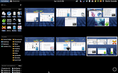
As I use my laptop for multiple purposes I have, after years of improving, ended up with tasks driven desktop sorting – one desktop for school/physics stuff, one desktop for graphics design, one desktop for programming, one desktop for web browsing, one desktop for various background things like mail client, music player, gajim, xchat and one desktop for the rest (e.g. for playing a movie). This very roughly correlates with the activities in gnome-shell so one would think I find this part of gnome-shell an improvement. Sadly the number of activities always reset to one on log-in and the desktops aren't sorted in the keyboard switcher (ctrl-alt-arrow) the same way as they look when zoomed out.
Plus, I don't have anywhere the small version of the desktop so unless I zoom out I have to remember in which desktop I am to be able to quickly switch between them. With this tightly connects missing task bar. You know I've already decided that I want these 3 applications/windows to represent one activity – that's why I have them all on one desktop. But to mouse-switch between them I still need to zoom out and oversee all the desktops. This becomes effectively very annoying when e.g. working with mail client and composing a mail while checking one of the other relevant mails, or checking an irc conversation relevant for the mail.
Another thing directly affected by that is practically impossible drag&dropping between applications (especially if the source app is maximized on desktop). But now back to switching between apps. You can object that I can use alt-tab. Yeah, that's good if I use keyboard, but when I'm browsing web or designing an icon, I'm more likely to hold mouse in my hand and rest the other hand away from keyboard. Plus, when I actually can effectively use alt-tab, the grouping of windows of one app (in my case usually terminals) makes the list on one hand shorter, on the other I have to use second hand (for arrows) to be able to select between that. Fail! I want to be able to switch between windows on one desktop with just alt-tab and don't want windows of the same kind but from different desktop mingle with that.
Another thing that I noticed is that rhythmbox cannot be minimized to systray and the systray icon actually thinks it is minimized all the time. It does work though with liferea and transmission. And it's rather annoying that partly thanks to the missing taskbar some actions like adding torrent from webbrowser to (already running) transmission does visually does nothing and I have to switch manually to the transmission window to finish the action. Similarly, opening an url from e.g. chat does not notify me, that a new browser tab has been added (in current gnome, midori task starts to bling in taskbar, whether it's one the current desktop or not and I can easily switch to it).
Let's move on now to another action (up until now, I've mostly talked about working with already opened applications) – starting new apps. The most annoying thing is that to start a new app I have to either zoom out first or use the alt-f2 app starter, which however does not suggest anything, so I have to type whole name. No one-click icons available somewhere in the panel. Oh, yes, there's a sidebar, which however looks odd, cannot be moved to the bottom and totally does not fit the rest of the theme. Plus it apparently have different favourite applications than the activities UI.
Next, when I want to open app on specific desktop, using mouse, I have to zoom out, select the desktop, zoom out, select the app and if it's already running, use right-click and hit open new window. Ugh. How is that effective compared to clicking on the destination desktop and then on the application launcher in panel? If I use keyboard, I have to search for the desired desktop first, which isn't exactly nice when all the desktops are lined up in one line then hit alt-f1, write (does not need to be whole) the app name (nope I cannot navigate through the favourites) and select the correct app to launch. I wonder how can I open new instance though... Furthermore, the 'APPLICATIONS | more' combo looks more like combo-box entry I have always urge to click on the 'applications' and write something there. What a surprise that's actually non-clickable!
And now the favourites – it took me some time to figure out that I need to right-click on the currently running app and select add to favourites. Does not seem I can reorder them to easier navigate through them :-( Plus I don't see a way to add an application that is not currently running to the favourites. Furthermore, gajim resists adding to favourites and instead disappears from the list completely if I try to add it (you can notice it on the screenshot too).
This should about summarize my findings about application/window management efficiency. So let's move on to the UI. I'll try to make this shorter. Date/Time applet is missing date (I have to click on it to find it), I don't seem to be able to navigate through the calendar using keyboard, there are locations missing, no weather. I miss various applets like CPU speed monitoring, network speed monitoring, trash (yup, I like to empty the trash by right-clicking on the panel applet if I'm currently not in nautilus) and lock-up (I use this so frequently that having to go through the user menu is suboptimal for me). I cannot recognize which of the things there are click-able... That's a totally broken design, usability-wise. I cannot move the "panel" to the bottom, which is where I prefer to have the systray. I don't see anywhere what keyboard layout I'm using. Do I have to actually write something to get to know whether I'm using US or CZE layout? Epic usability fail! The fonts does not seem to respect my settings for subpixel hinting and ignore it completely. The applets in systray are too far from each other, the black/white colour combo isn't too my liking, but I cannot change it. The odd blue mists/rectangles aren't exactly nice either… I'm not sure if it's because my intel graphics is suboptimal, but shadows, especially those of tooltips are badly misrendered and actually odd as well – why is window shadow smaller than window?
Oh and one last thing – I've quite a few times zoomed out by mistake by moving the mouse to top-left corner. Can I disable it somewhere?
Summarized, gnome-shell isn't for me as it both looks ugly to me and greatly decreases efficiency of my work. Sorry guys, but I would much rather appreciated if you fixed e.g. gtk2 limitations in theming (non-transparent backgrounds for entries, progress bars and tooltips to quote a few) in gtk3 than working on this rather dubious experiment.
Subscribe to:
Posts (Atom)


