Wednesday, 27 February 2013

Consistent Perspective in a Group of Icons – How To

I've been creating a bunch of Echo icons lately and one thing I wondered how to do properly is perspective. It's easy to do thinks consistently if you're using some kind of metric projection (e.g. isometric), because you have simple linear transformations from (X, Y, Z) to (x, y). That's not true for perspective. How the 3D projects to 2D depends on the shape, on the position, on the size and many more factors when projecting with perspective. Because I was creating many icons at once, all flat ones with constant thickness, I wanted to do this not only consistently, but also quickly. I've came up with the following workflow.

Start with drawing the front face of the icon on the canvas, just like if you were drawing pure 2D.
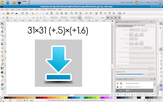
Then duplicate the canvas as well as the icon shape. Don't forget to change colours so that you can easily tell them apart.
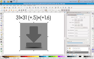
Next change the size of them by some factor and use the same factor for every icon you create and is supposed to have the same thickness. The resize should be done to both canvas and the icon shape at the same time so that it scales properly, keeping the ratios and position of the icon on canvas.
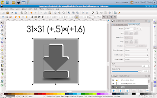
Then move the resized canvas together with the icon shape to it's new position. Again this has to be done consistently for all icons with the same thickness. You can imagine that the original and edited canvas create together some kind of cuboid whose front and back faces are squares, even in the 2D projected image its thickness regulates thickness of the icons and the relative position of its back side to the front side controls your point of view.
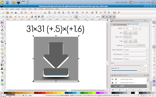
Next delete the changed canvas (we don't need it anymore) and put the back side of the icon behind the front one.
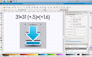
Next you should remember that you're doing an icon so it should be properly aligned to pixel grid in order to look crisp. This can be done quickly with the help of inkscape grid feature.
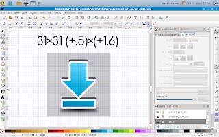
Now we have front and back side of the icon, but we still don't have it's sides, as can be seen on the next picture.

The easiest and for simple icons also the best way to do them is to duplicate the front side again, merge it with the back side and fix those bumpy parts to look as you'd expect them using the node tool.
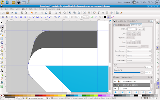
Now the icon is only missing some shading and outline.
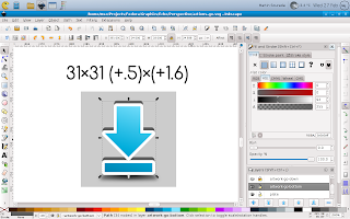
So next we add some gradients to make it look as we wish – this can be a tedious task, depending on how realistic we want the icon to look. On small size like this one it can be greatly simplified though. And finally we add an outline. This can be done by duplicating the edited shape again, adding an outline that is twice as wide as we want it to be (because half of it will be hidden) and push it bellow the whole icon. The result looks like this:
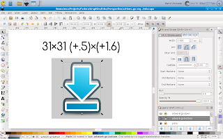
Finally we render the icon in desired size with transparent canvas and it looks like this:

I hope you like my today's how-to :-) Also, bear in mind that this is greatly simplified perspective projection as we use it in icons, if you were going for fully realistic painting you'd quickly find this workflow isn't suited for such task.

Monday, 11 February 2013

[New Fedora Package] Tagaini Jisho – A Japanese dictionary and study assistant

Dear fellow Japanese language students, rejoice. I've been using the app in title for a while, but I finally got around to do a proper Fedora package and push it to Fedora ;-) So installing is now super easy.

  • For Rawhide:
    su -c 'yum install tagainijisho'
  • For Fedora 17 and Fedora 18 (I decided not to support Fedora 16 as it's going to be EOLed shortly):
    su -c 'yum install tagainijisho'

Tagaini Jisho is a cool piece of software, an irreplaceable tool for anyone learning Japanese. You can use it not only as a Japanese-%{your-language} dictionary/kanji search tool, you can also use it to learn the words, and to learn the Japanese characters. Hiragana, Katakana, Kanji – all included, and with animated stroke order diagrams! More info on www.tagaini.net. Some screenshots bellow:

Update 2013/02/21: Tagaini Jisho has been tagged to stable repos for Fedora 17 onward. The issue with dictionaries mentioned in comments is also fixed in that push. Enjoy!

Thursday, 7 February 2013

(XFCE) Terminal and XChat Colour Scheme

I'm a regular terminal user and with F18 I switched back from Sakura to XFCE Terminal, because for some reason sakura refused to get configured as before (I think I wasn't able to remove window borders anymore)—I prefer terminal in some kind of semi-full-screen mode, i.e. maximized (but with DE panel[s] still visible), without menu, without window borders, without scrollbars. And while I was at the configuring, I decided to change the default colour scheme. It's not like I particularly dislike it, but as a regular mc (midnight-commander—there isn't a better file manager out there) user, I kinda grew to dislike the blueness of the default blue and some kind of colour combinations weren't exactly easy to read (hinted fonts are partially to blame for that though, by design). So first I searched a bit over the net, but didn't find anything satisfactory, so I decided to adapt Echo Icon Theme Palette for terminal use (black terminal, I've also prepared a bright/inverse version for xchat). First how it looks:

And now for the actual colours. Here's an excerpt from ~/.config/Terminal/terminalrc:

BackgroundMode=TERMINAL_BACKGROUND_TRANSPARENT
BackgroundDarkness=0.950000
ColorPalette1=#000000000000
ColorPalette2=#b4b400000000
ColorPalette3=#0000aaaa0000
ColorPalette4=#cbcb7c7c0000
ColorPalette5=#00003f3f6868
ColorPalette6=#bfbf0000efef
ColorPalette7=#0000a61dd074
ColorPalette8=#c6c6c6c6c6c6
ColorPalette9=#5ef75ef75ef7
ColorPalette10=#ffff52990000
ColorPalette11=#9393dada0000
ColorPalette12=#ffffe1e13939
ColorPalette13=#00007373a2a2
ColorPalette14=#dbdb8181ffff
ColorPalette15=#8181e3e3ffff
ColorPalette16=#ffffffffffff
ColorForeground=#c6c6c6c6c6c6
ColorCursor=#c6c6c6c6c6c6
TabActivityColor=#00003f3f6868
ScrollingSingleLine=FALSE

You can notice I also included ScrollingSingleLine=FALSE—that makes shift+arrows work in mc to select items ;-)

And now from ~/.xchat2/colors.conf

color_0 = 0000 0000 0000
color_1 = ffff ffff ffff
color_2 = 5050 d8d8 ffff
color_3 = 5b5b b5b5 0000
color_4 = ecec 2828 0000
color_5 = d7d7 a1a1 3c3c
color_6 = d4d4 6767 ffff
color_7 = b4b4 0000 0000
color_8 = 6666 3c3c 0000
color_9 = 0606 9090 0000
color_10 = 0000 7373 a2a2
color_11 = 0000 3f3f 6868
color_12 = 0000 adad dbdb
color_13 = bfbf 0000 efef
color_14 = 5e5e 5e5e 5e5e
color_15 = 3030 3030 3030
color_16 = 0000 0000 0000
color_17 = ffff ffff ffff
color_18 = 5050 d8d8 ffff
color_19 = 5b5b b5b5 0000
color_20 = ecec 2828 0000
color_21 = d7d7 a1a1 3c3c
color_22 = d4d4 6767 ffff
color_23 = b4b4 0000 0000
color_24 = 6666 3c3c 0000
color_25 = 0606 9090 0000
color_26 = 0000 7373 a2a2
color_27 = 0000 3f3f 6868
color_28 = 0000 adad dbdb
color_29 = bfbf 0000 efef
color_30 = 5e5e 5e5e 5e5e
color_31 = 3030 3030 3030
color_256 = ffff ffff ffff
color_257 = 0000 7373 a2a2
color_258 = 0000 0000 0000
color_259 = ffff ffff ffff
color_260 = cccc 1010 1010
color_261 = 0606 9090 0000
color_262 = 0000 7373 a2a2
color_263 = 5b5b b5b5 0000
color_264 = 5e5e 5e5e 5e5e

Hope it's useful to other people than me as well. I find it both easier on eyes, and having better readability (with the font I'm using, it seems this one is important too).

PS: For those wondering about some differences of my desktop compared to previous screenshots—when trying out CentOS 6, I got addicted to analog clock ;-) And a little while before I decided to hide the bottom panel automagically to have more space for apps.

PPS: My apologies for having some comments in my moderation queue for too long, somehow I wasn't notified via mail, or missed them. I definitely don't censor, the moderation is for spam purposes only (or for cases were people post the same reaction multiple times).

Update (2013/08/08): In Fedora 19 (and newer), the xfce terminal config is in different place and colours are specified slightly different. Here's excerpt from ~/.config/xfce4/terminal/terminalrc:

ColorPalette=#000000;#b40000;#00aa00;#cb7c00;#003f68;#bf00ef;#00a6d0;#c6c6c6;#5e5e5e;#ff5200;#93da00;#ffe139;#0073a2;#db81ff;#81e3ff;#ffffff
ColorCursor=#c6c6c6c6c6c6
TabActivityColor=#00003f3f6868
ColorForeground=#c6c6c6c6c6c6