Wednesday 28 October 2009

Answer to: Why is my design blurry?

Short answer – unlike paper, display is a discrete medium.

Long answer, bellow.

When you prepare designs that will be printed, or when you are painting on paper, you usually do not have to care about some "pixel" grid. Thanks to the small size of dots when printing or the small size of paint particles when painting, you don't have to worry about fitting them in a grid, either because there is no grid at all or because the particles are much smaller than an eye could discern. On the other hand, displays have rather big grids, with resolution usually about 100 dpi, which means there are 100 particles per inch. You can easily imagine that with such small resolution, people with good eyes easily notice when something is not aligned to this grid, or isn't smoothed (we call it antialiasing).

For inkscape, cairo and other similar libraries and applications we can visualize the pixel grid like this:

The black lines represent coordinates used by cairo, inscape, ... while the squares inbetween are the actual pixels. Now imagine you'd like to draw a blue rectangle on (1,1) with width = 6 and height = 4. If you pass these numbers as its coordinates it will look like this:

This is fine, as the rectangle nicely fits into the grid. Such a rectangle would look crisp if displayed in 1:1

Now, if you decide to draw it with 1px wide border at the same coordinates with the same dimensions, how it will look like? Will the border be drawn outside the original rectangle or inside it? Neither is correct:

As you can probably guess, this will look blurry as the border ended up in between the pixels and thus is misaligned. You can correct this by shifting the position by 0.5px and making the dimensions smaller by twice the value:

If you now compare the two cases in original size, I think anyone can see (at least with the help of magnifier) the difference:


This work very similar for other shapes as well. It's important to bear in mind that the imaginary line in terms of coordinates marks the boundary of fills but the center of borders and that the grid lines are inbetween the pixels. You have to position your drawings appropriately in order to look crisp.

But what about fonts? See my previous post to see the main problem with them. Sadly inkscape does not offer better smoothing than greyscale for fonts, so you have to either use gimp, or align each letter manually (tedious).

Monday 26 October 2009

Mark the difference (ugly fonts in Fedora?)

So, in my previous post there started appearing discussion about fonts antialiasing. So I though it would be better to spin off this discussion in a post of it's on, installed freetype-freeworld (which improved drastically fonts in chromium, but did nothing with gtk), fired up gimp and created this (click on the image to see it in its original size if it looks blurry):

The first line is no antialiasing, no hinting, the second one is antialiasing only, the third one is antialiasing+hinting and last one is antialiasing+hinting with forced autohinter. Looks like no hinting or autohinter is what can be achieved without installing the package from rpmfusion, while the third line needs the package with patented stuff in. Apparently, no antialiasing isn't a solution – we're not living in stone age, antialiasing without hinting is blurry and autohinter works good only for small sizes, on the other hand, the hinting without autohinter breaks on simple japanese… Make your own image about what's best.

And as a bonus: hinting without autohinter in chromium


autohinter in midori


Dunno how you, but I see the autohinter as best working for me.

Saturday 24 October 2009

Gnome-shell…

… or the Adventures of an Advanced User in a Wonderland. So, yesterday, more than 24 hours ago, I've turned on gnome-shell (in F12) with the intention to try work with it and prepared pencil and paper with the intention to scribe down what's good and what's bad on it. And now the paper (approx A5) is full of what's bad and only one note of which I'm unsure whether it's good or bad. That basically means that I either hope that this experiment will drastically improve before it will be made default in gnome, or will depart to the nether world.

To easier grasp how my usual workflow looks like here's the screenshot:

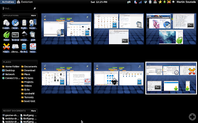
As I use my laptop for multiple purposes I have, after years of improving, ended up with tasks driven desktop sorting – one desktop for school/physics stuff, one desktop for graphics design, one desktop for programming, one desktop for web browsing, one desktop for various background things like mail client, music player, gajim, xchat and one desktop for the rest (e.g. for playing a movie). This very roughly correlates with the activities in gnome-shell so one would think I find this part of gnome-shell an improvement. Sadly the number of activities always reset to one on log-in and the desktops aren't sorted in the keyboard switcher (ctrl-alt-arrow) the same way as they look when zoomed out.

Plus, I don't have anywhere the small version of the desktop so unless I zoom out I have to remember in which desktop I am to be able to quickly switch between them. With this tightly connects missing task bar. You know I've already decided that I want these 3 applications/windows to represent one activity – that's why I have them all on one desktop. But to mouse-switch between them I still need to zoom out and oversee all the desktops. This becomes effectively very annoying when e.g. working with mail client and composing a mail while checking one of the other relevant mails, or checking an irc conversation relevant for the mail.

Another thing directly affected by that is practically impossible drag&dropping between applications (especially if the source app is maximized on desktop). But now back to switching between apps. You can object that I can use alt-tab. Yeah, that's good if I use keyboard, but when I'm browsing web or designing an icon, I'm more likely to hold mouse in my hand and rest the other hand away from keyboard. Plus, when I actually can effectively use alt-tab, the grouping of windows of one app (in my case usually terminals) makes the list on one hand shorter, on the other I have to use second hand (for arrows) to be able to select between that. Fail! I want to be able to switch between windows on one desktop with just alt-tab and don't want windows of the same kind but from different desktop mingle with that.

Another thing that I noticed is that rhythmbox cannot be minimized to systray and the systray icon actually thinks it is minimized all the time. It does work though with liferea and transmission. And it's rather annoying that partly thanks to the missing taskbar some actions like adding torrent from webbrowser to (already running) transmission does visually does nothing and I have to switch manually to the transmission window to finish the action. Similarly, opening an url from e.g. chat does not notify me, that a new browser tab has been added (in current gnome, midori task starts to bling in taskbar, whether it's one the current desktop or not and I can easily switch to it).

Let's move on now to another action (up until now, I've mostly talked about working with already opened applications) – starting new apps. The most annoying thing is that to start a new app I have to either zoom out first or use the alt-f2 app starter, which however does not suggest anything, so I have to type whole name. No one-click icons available somewhere in the panel. Oh, yes, there's a sidebar, which however looks odd, cannot be moved to the bottom and totally does not fit the rest of the theme. Plus it apparently have different favourite applications than the activities UI.

Next, when I want to open app on specific desktop, using mouse, I have to zoom out, select the desktop, zoom out, select the app and if it's already running, use right-click and hit open new window. Ugh. How is that effective compared to clicking on the destination desktop and then on the application launcher in panel? If I use keyboard, I have to search for the desired desktop first, which isn't exactly nice when all the desktops are lined up in one line then hit alt-f1, write (does not need to be whole) the app name (nope I cannot navigate through the favourites) and select the correct app to launch. I wonder how can I open new instance though... Furthermore, the 'APPLICATIONS | more' combo looks more like combo-box entry I have always urge to click on the 'applications' and write something there. What a surprise that's actually non-clickable!

And now the favourites – it took me some time to figure out that I need to right-click on the currently running app and select add to favourites. Does not seem I can reorder them to easier navigate through them :-( Plus I don't see a way to add an application that is not currently running to the favourites. Furthermore, gajim resists adding to favourites and instead disappears from the list completely if I try to add it (you can notice it on the screenshot too).

This should about summarize my findings about application/window management efficiency. So let's move on to the UI. I'll try to make this shorter. Date/Time applet is missing date (I have to click on it to find it), I don't seem to be able to navigate through the calendar using keyboard, there are locations missing, no weather. I miss various applets like CPU speed monitoring, network speed monitoring, trash (yup, I like to empty the trash by right-clicking on the panel applet if I'm currently not in nautilus) and lock-up (I use this so frequently that having to go through the user menu is suboptimal for me). I cannot recognize which of the things there are click-able... That's a totally broken design, usability-wise. I cannot move the "panel" to the bottom, which is where I prefer to have the systray. I don't see anywhere what keyboard layout I'm using. Do I have to actually write something to get to know whether I'm using US or CZE layout? Epic usability fail! The fonts does not seem to respect my settings for subpixel hinting and ignore it completely. The applets in systray are too far from each other, the black/white colour combo isn't too my liking, but I cannot change it. The odd blue mists/rectangles aren't exactly nice either… I'm not sure if it's because my intel graphics is suboptimal, but shadows, especially those of tooltips are badly misrendered and actually odd as well – why is window shadow smaller than window?

Oh and one last thing – I've quite a few times zoomed out by mistake by moving the mouse to top-left corner. Can I disable it somewhere?

Summarized, gnome-shell isn't for me as it both looks ugly to me and greatly decreases efficiency of my work. Sorry guys, but I would much rather appreciated if you fixed e.g. gtk2 limitations in theming (non-transparent backgrounds for entries, progress bars and tooltips to quote a few) in gtk3 than working on this rather dubious experiment.

Saturday 17 October 2009

Echo Icons - Lighting and Shadows

So, with sketches for hard-drive for Echo Perspective,

I've started to wonder how exactly we've used the top-face lighting in Echo and how it looks in real life. Looking at the current Echo guidelines (mostly done by me) it looks like this:

And when I sat down and thought about this, it actually looks a bit weird. So I've spent today with estimating (and in case of perspective projection also observating) lighting of cubes and balls and their dropped shadow. I imitated Echo lighting to be approximately caused by light positioned at (3,-3,5) + some amount of homogeneously dispersed light if the cube occupies [0,1]x[0,1]x[0,1] space. Of course, in Echo we don't use realistic lighting and shadows but something that makes the icons more usable. The result looks like this:

So, I wonder what do you folks reading the Fedora (Design) Planet think? It's still not too late to adjust the guidelines for Echo Perspective, albeit for "Old" Echo it would mean that out of blue many icons would violate such guideline…

Thursday 8 October 2009

Nodoka Rework Update II

Following on my previous post, I've finally got around to do some more updates to my nodoka rewrite and blog about it ;-) This time it's about the Entry widget. While last time I complained "only" about difficulties with exterior focus in Button widgets this time around it's many times worse even.

First of all, exterior focus behaves slightly different from how it behaves in Button widget, so I had to do another slightly different workaround for Entry. Well, it took me some time before I "reverse-engineered" the behaviour to work with all exterior-focus, focus-line-width and focus-padding settings as I'd like it to, but I seem to have figured it out. This is probably connected with the fact that focus for entry is drawn via the draw_focus functions only if its exterior, so I had to skip this one and render the focus along when drawing the actual widget to keep at least some consistency in the code.

To make engine coding for entries even harder, the state_type sent to the drawing functions is wrong when the widget is insensitive... That makes another, albeit simple hack :(

And because of the way entry is implemented in GTK, there are up to four GdkWindows (one main for the whole entry, one for the text, and up to two for side icons), which aren't transparent and furthermore filled not with what's behind them but with base colour, one has to: repaint the background to be hopefully the correct one (which of course breaks when the entry is on toolbar with gradient) and from the inside windows check their relative position to the main window and paint the entry once more (to allow nice smooth rounded corners and bigger paddings for inner focus). This means you either sacrifice design or speed, I sacrificed the speed, but am seriously playing with the thought of introducing an engine option to disable this hack for gtkrc designers that prefer speed and are willing to give up some of the design freedom.

Now this is all nice but there are (at least) two applications that are even worse -- evolution and epiphany has their location/search bar composed of actually two entries and some icons and "guessing" from the inner entry where the outer one is is beyond my willingness to implement... Luckily enough, evolution behaves pretty decent with wide range of settings and epiphany got fixed in 2.28.

And now some screenshots:


As you can see it's still miles from done, but I try to keep it fully functional (and as much bug free as I can). For those who actually would like to test it I recommend building from git but there's a chance I'll put my locally built testing rpms on fedorapeople if there would be enough requests ;-)


On a completely unrelated note, I've just discovered freely (and legally) downloadable new recording of Bach's Brandenburg Concertos in FLAC. Yay, kudos for the Czech Radio. Actually I've been listening to the Czech Radio D-Dur station live broadcast (ogg 256kbit) for quite a few days now and I am both more than happy with both the quality of the selected music as well as the quality of the broadcast (further more in OGG Vorbis!). But back to Brandenburg Concertos -- I'm about half done with the listening and I have to say that while the style seemed a bit unusual at first it won me over after a one or two movements and I consider it one of the better Brandenburg Concertos recordings I've heard.

Sunday 4 October 2009

Constantine Beta Wallpaper

We've prepared wallpapers for Constantine Beta, and we look for feedback, preferably on the Fedora Design Team List. You can comment on my blog too and I rely your opinions to the design team then. Installing it is as easy as
yum --enablerepo=rawhide install constantine-backgrounds for GNOME or
yum --enablerepo=rawhide install constantine-kde-theme for KDE. We also have prepared extras (only for GNOME now):
yum --enablerepo=rawhide install constantine-backgrounds-extras. The default wallpaper looks on my Rawhide as this:

the extras can be seen in the gnome-background-properties bellow (the universe slideshow is from gnome):

blogs.fp.o

So, I've discovered a Fedora Project run weblog site and I'm wondering what's the state of it. Since the url does not include publictest# I guess it's not a testing instance, so I've created a blog there :-D Does anyone know if it's ready for starting to use? And since it's supposed to be for fedora contributors I wonder about 15MB limit for media -- people would probably like to post screencasts and such things are big, so the 15MB limit might be used up quite fast and I'm not sure if fedorapeople space is a good place to store supporting media for their blogs on...