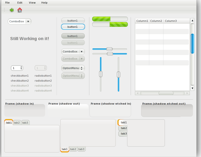
As mentioned in the documentation, I'll introduce new configuration options among which there is one called style. It will have three different values to choose from. The first one is CLASSIC, which is basically a continuation of the current design and will mostly contain small adjustments or fixes, plus it will most likely will be able to cope with the new configuration options. I made a fake screenshot in inkscape of The Widget Factory window to outline what the small changes will most likely be in the near future. These changes will also get backported to the 0.7.x branch and will most likely be present in Fedora 10. Here's the image:

The second one is MODERN and is an evolution of the CLASSIC one, but features more drastic changes, like theming previously "non-themed" widgets, introducing gradinents where previously weren't, etc. It will most likely be default in Fedora 11. See for yourself:

The last choice is GLOSSY and is actually being designed by Andy Fitzsimon. It won't be default in Fedora (or at least next two releases), but available via the gtk-engine-nodoka-extras package ;-) The widget factory mockup is not complete yet, but here's the WIP:

Most of the stuff I posted here is also at the 0.8.x Brainstorming wiki, the GLOSSY one will be added there as soon as it's finished. Until then you can follow the thread that started it on the fedora-art-list.
[sarcasm_mode=ON] BTW. I write the documentation in Plain TeX and I think that Plain is the only true God of typesetting and that all LaTeX-ists are heretics and need to be exterminated :-D [/sarcasm_mode] Hehe, just joking, I really write it in Plain, but the rest is just a big fat lie :-p
As usual I am greatful for any kind of (constructive) feedback. You can leave it either here in the comments, or in the fedora-art-list. Or, if you happen to see me on IRC on #fedora-art we can discuss it there as well, my nick is msourada.


5 comments:
sorry, but seem the glossy image cannot be loaded, flickr returns picture not available, can we see it please:)
Otherwise the new style is awesome I bet I'll use it once it is available (and substitute aurora with it)
Just noticed it as well... Seems like I'll need to export PNG from one of the previous SVGZ versions Andy posted on the art-list or wait for the final one. Dunno, why this one disappeared :(
OK, I e-mailed Andy for the sources and put the result PNG on my fedorapeople page. The blog post is now showing all three images :-p
GLOSSY looks the nicest. Needs more green though, less blue.
Thank you for providing the last screen shot.
IMO the GLOSSY need more relief for the controls (i.e. buttons and the inherited elements) as now they do not seem to be distinguishable enough as control elements in the application, they merge too much with the background.
Also the big curvatire value will cause big issues in FF (well maybe there will be some nice hack to overcome this limitation).
For glossy - progress bar in glossy should either be smaller (i.e. a hack to draw the widget in part of the area exposed by the toolkit and not the whole area) or should not have such big curvature. It looks strange, almost un-recognizable. Just kidding, keep up with the good work, the more variety we have the more the users will tend to consolidate different engines in one theme to reach the desired look (probably also feel) of a modern desktop. Still, I consider glossy not being appropriate for Fedora as a default theme at all.
Post a Comment