Monday, 31 December 2012

Designing Echo icons again

It's been a while since I designed my last icon but for one reason or another I decided I need to make some progress with Echo Perspective Icon Theme again… The final push was me playing with colours—when I had started writing code for Nodoka, I begun with a colour representation. Since we use gradients and shades a lot, I decided to go colour managed and started researching about colour representations and ended up redoing Echo colour palette in sRGB using CIE Luv (in Luma, Chroma, Hue coordinates) as a working space.

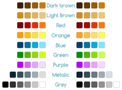
The resultant palette is redone from scratch based on the Echo (Perspective) icons that have been already released instead of the current palette for better consistency, but it's "normalized" WRT CIE Luv colour space. The result looks like this:

The right column actually uses normalization WRT CIE Lab colour space, but I decided to stick with the CIE Luv one, which is in the left column. The differences are subtle though.

From there it was ony one step to doing icons, actually. I went all out and decided that I'll

  • make more sizes than before to better support current and future DEs, i.e. 16×16, 22×22(24×24), 32×32, 48×48, 64×64, 128×128 and 256×256;
  • make similar icons in a single file svg (which means I'll need to write some helper libraries to help split it automatically during build);
  • start with action icons in media player, browser and related, which is 23 icons in two groups.

Well, it's a lot of work—23 icons, each in 7(8) sizes, that's 161 pictures. Ugh, that will take a while... Some preview WIP is bellow:

You can notice some design changes, some are new, some have been appearing for a while already, albeit inconsistently. First I went back to slightly darker blue hues than what we were doing recently, it makes better contrast and should work a bit better with darker backgrounds. You could have noticed this design change in my nodoka designs as well (there were three icons in them).

Second change that has been already visible in nodoka designs, is departure from sharp corners. They make the images unnecessary bigger (especially the arrows) and look kinda oldish. I decided that the white outline as well as border should have rounded corners. IMHO it looks better and I hope to retain this style consistently throughout Echo Perspective.

Last change is to shapes—first one I did was view-refresh. The old two big arrows looks sort of heavy and are hard to do at smaller sizes. So I've done something simpler and later I noticed that my new e-book reader uses similar style while loading, lol. My primary source of inspiration in this was an anime I liked for its easygoing style and, believe it or not, typesetting (the anime is called acchi kocchi):

Second shape change was for process-stop icon from circle to the more common octagon. And finally a small change to media-record icon for it to be better distinguished from similar dialog related icons like dialog-no.
Friday, 30 November 2012

Color Challenge

It took up tatica's challenge, and to my own astonishment I scored perfect. I did it in a room, at night with medium bright indirect lighting, on a LCD screen that came with my 6 years old laptop. There where a couple of colours I wasn't 100 % sure of, but it seems I leaned towards the correct choices after a couple of switch-compare-switch-compare rounds. What helped me was that while two colours seemed sometimes almost same, when grouped with other already sorted colours, when they were in wrong order, they stood out.

Sunday, 9 September 2012

Nodoka Concept Art—Finished

It's been a year, a month and a day (and a couple of hours) since my last update to Nodoka concept art (well, I've been lazy, busy with other stuff and since vast majority of my apps are still GTK2, there was also no need). Over the weekend I've finished the last one—Noir. The current Nodoka style will remain as Classic. As it will be mostly unchanged (sans maybe some small modifications to shadows) I haven't done any concept art for that. I hope it won't be another year before I start writing code, actually… Anyway, here are the pics (roughly sorted from brightest to darkest), enjoy!

Nodoka Glossy

Nodoka Classic

Nodoka Modern

Nodoka Noir

If the pictures are blurry you can see them in original size on Nodoka 1.x concept art wiki page.

I hope you like it, comments are welcomed. Also bear in mind that this is concept art, not a working example. So the working example will look slightly different and moreover I haven't started writing it yet.

Thursday, 6 September 2012

Fedora 18 Alpha Wallpaper

It's rather old news, but today it has been finally set as default—yes the wallpaper for Fedora 18 Spherical Cow release. It took so much time because I didn't manage to update the package that sets the defaults in time before Alpha freeze.

You probably have a general idea of what the wallpaper looks like from my post about pre-alpha version of it, but since then it has been polished a bit—mizmo did a great job on that—and now it looks like this ;-)

Enjoy.

Update Sep 08: I'm not the author of the wallpaper, just a packager, so do not thank me ;-) However, I'm relaying your feedback to the design-team, so I really appreciate all the comments you've posted so far. I'll keep both my readers as well as the design team informed about news on both sides, so comment more and stay tuned for updates ;-)

Midori—Two New Improvements

Those of you who have been following my blog for a long time probably know that for various reasons (to list a few—it's still in gtk2, uses webkit, has tab panel feature, it's fast, has simple, yet powerful UI, uses gstreamer for html5 video …) I'm a user (and fan) of a lightweight xfce web-browser called Midori (it's from Japanese 緑 which means green). For these past few months I've been constantly annoyed by two of it's shortcommings—loading of pages have become slooooow and very CPU intensive; and java plugins crashed the browser upon applet removal (e.g. by reloading or closing the page). Today I've figured fixes for both!

Sluggish page loading—caused by cookie manager

Today I've noticed that the very same pages that are freezing the UI upon load for a few seconds does not suffer from these issues when opened in web-app mode. So my guess was like—either user style/script or plugin fault. A simple try-and-error quickly yielded results. The plugins that is at fault is cookie manager, though I haven't got the slightest idea why. So if you suffer from similar problems, just disable cookie manager and you'll be back to the usual swiftness of webkit based browsers.

Crashing java plugin—fixed in icedtea-web-1.3

Yes, yesterday on Fedora Planet I read the release information about new icedtea-web plugin and since it contained info about google chrome fixes, I guessed it might improve my midori experience as well. However as there was still no build for fedora today morning, I decided to build it myself. So I did (was as easy as downloading the new tarbal and bumping the version in rpm spec file) and to my great joy, java applets now load faster and do not crash upon exit. What a great day!

Saturday, 11 August 2012

Fedora 18 Pre-Alpha Wallpaper

It's been a while since I last blogged, but as I have some design news, it's worth writing a blog post again. Yesterday there was another design team meeting&hackfest and we were able to agree on the theme for the Fedora 18 Sperical Cow wallpaper. The latest iteration, I still call it pre-alpha because I expect there'll be some polishing yet before alpha release looks like this:

I've packaged it and submitted a review request, which is currently in need of a reviewer.

We at the design team hope you'll like it and of course are open to comments and suggestions. We'll hear you out in our usual channels: #fedora-design @ irc.freenode.net and Fedora Design Team Mailing List.