… or the Adventures of an Advanced User in a Wonderland. So, yesterday, more than 24 hours ago, I've turned on gnome-shell (in F12) with the intention to try work with it and prepared pencil and paper with the intention to scribe down what's good and what's bad on it. And now the paper (approx A5) is full of what's bad and only one note of which I'm unsure whether it's good or bad. That basically means that I either hope that this experiment will drastically improve before it will be made default in gnome, or will depart to the nether world.
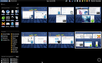
To easier grasp how my usual workflow looks like here's the screenshot:

As I use my laptop for multiple purposes I have, after years of improving, ended up with tasks driven desktop sorting – one desktop for school/physics stuff, one desktop for graphics design, one desktop for programming, one desktop for web browsing, one desktop for various background things like mail client, music player, gajim, xchat and one desktop for the rest (e.g. for playing a movie). This very roughly correlates with the activities in gnome-shell so one would think I find this part of gnome-shell an improvement. Sadly the number of activities always reset to one on log-in and the desktops aren't sorted in the keyboard switcher (ctrl-alt-arrow) the same way as they look when zoomed out.
Plus, I don't have anywhere the small version of the desktop so unless I zoom out I have to remember in which desktop I am to be able to quickly switch between them. With this tightly connects missing task bar. You know I've already decided that I want these 3 applications/windows to represent one activity – that's why I have them all on one desktop. But to mouse-switch between them I still need to zoom out and oversee all the desktops. This becomes effectively very annoying when e.g. working with mail client and composing a mail while checking one of the other relevant mails, or checking an irc conversation relevant for the mail.
Another thing directly affected by that is practically impossible drag&dropping between applications (especially if the source app is maximized on desktop). But now back to switching between apps. You can object that I can use alt-tab. Yeah, that's good if I use keyboard, but when I'm browsing web or designing an icon, I'm more likely to hold mouse in my hand and rest the other hand away from keyboard. Plus, when I actually can effectively use alt-tab, the grouping of windows of one app (in my case usually terminals) makes the list on one hand shorter, on the other I have to use second hand (for arrows) to be able to select between that. Fail! I want to be able to switch between windows on
one desktop with just alt-tab and don't want windows of the same kind but from different desktop mingle with that.
Another thing that I noticed is that rhythmbox cannot be minimized to systray and the systray icon actually thinks it is minimized all the time. It does work though with liferea and transmission. And it's rather annoying that partly thanks to the missing taskbar some actions like adding torrent from webbrowser to (already running) transmission does visually does nothing and I have to switch manually to the transmission window to finish the action. Similarly, opening an url from e.g. chat does not notify me, that a new browser tab has been added (in current gnome, midori task starts to bling in taskbar, whether it's one the current desktop or not and I can easily switch to it).
Let's move on now to another action (up until now, I've mostly talked about working with already opened applications) – starting new apps. The most annoying thing is that to start a new app I have to either zoom out first or use the alt-f2 app starter, which however does not suggest anything, so I have to type whole name. No one-click icons available somewhere in the panel. Oh, yes, there's a sidebar, which however looks odd, cannot be moved to the bottom and totally does not fit the rest of the theme. Plus it apparently have different favourite applications than the activities UI.
Next, when I want to open app on specific desktop, using mouse, I have to zoom out, select the desktop, zoom out, select the app and if it's already running, use right-click and hit open new window. Ugh. How is that effective compared to clicking on the destination desktop and then on the application launcher in panel? If I use keyboard, I have to search for the desired desktop first, which isn't exactly nice when all the desktops are lined up in one line then hit alt-f1, write (does not need to be whole) the app name (nope I cannot navigate through the favourites) and select the correct app to launch. I wonder how can I open new instance though... Furthermore, the 'APPLICATIONS | more' combo looks more like combo-box entry I have always urge to click on the 'applications' and write something there. What a surprise that's actually non-clickable!
And now the favourites – it took me some time to figure out that I need to right-click on the currently running app and select add to favourites. Does not seem I can reorder them to easier navigate through them :-( Plus I don't see a way to add an application that is not currently running to the favourites. Furthermore, gajim resists adding to favourites and instead disappears from the list completely if I try to add it (you can notice it on the screenshot too).
This should about summarize my findings about application/window management efficiency. So let's move on to the UI. I'll try to make this shorter. Date/Time applet is missing date (I have to click on it to find it), I don't seem to be able to navigate through the calendar using keyboard, there are locations missing, no weather. I miss various applets like CPU speed monitoring, network speed monitoring, trash (yup, I like to empty the trash by right-clicking on the panel applet if I'm currently not in nautilus) and lock-up (I use this so frequently that having to go through the user menu is suboptimal for me). I cannot recognize which of the things there are click-able... That's a totally broken design, usability-wise. I cannot move the "panel" to the bottom, which is where I prefer to have the systray. I don't see anywhere what keyboard layout I'm using. Do I have to actually write something to get to know whether I'm using US or CZE layout? Epic usability fail! The fonts does not seem to respect my settings for subpixel hinting and ignore it completely. The applets in systray are too far from each other, the black/white colour combo isn't too my liking, but I cannot change it. The odd blue mists/rectangles aren't exactly nice either… I'm not sure if it's because my intel graphics is suboptimal, but shadows, especially those of tooltips are badly misrendered and actually odd as well – why is window shadow smaller than window?
Oh and one last thing – I've quite a few times zoomed out by mistake by moving the mouse to top-left corner. Can I disable it somewhere?
Summarized, gnome-shell isn't for me as it both looks ugly to me and greatly decreases efficiency of my work. Sorry guys, but I would much rather appreciated if you fixed e.g. gtk2 limitations in theming (non-transparent backgrounds for entries, progress bars and tooltips to quote a few) in gtk3 than working on this rather dubious experiment.


